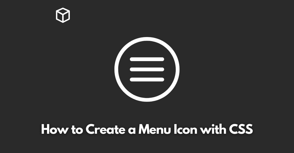
As a software developer, creating a menu icon with CSS is a common task.
With CSS, you can style and create beautiful icons for your website or application with ease.
In this tutorial, we’ll walk you through the process of creating a menu icon with CSS step by step, along with code examples.
Step 1: Define the HTML Structure
The first step is to define the HTML structure for our menu icon. The HTML structure for a menu icon is straightforward.
All you need is a container for your icon and an unordered list that will be used to define the menu.
Step 2: Style the Menu Icon with CSS
In this step, we’ll use CSS to style our menu icon. To create a menu icon, we need to style the unordered list and its items to form the desired shape. In this example, we’ll create a simple three-bar menu icon.
.menu-icon {
  width: 40px;
  height: 30px;
}

.menu-icon ul {
  margin: 0;
  padding: 0;
  list-style: none;
  position: relative;
}

.menu-icon ul li {
  background: #333;
  width: 40px;
  height: 3px;
  position: absolute;
  left: 0;
  top: 0;
  -webkit-transform-origin: left center;
  transform-origin: left center;
}

.menu-icon ul li:nth-child(1) {
  -webkit-transform: rotate(0deg);
  transform: rotate(0deg);
  top: 10px;
}

.menu-icon ul li:nth-child(2) {
  -webkit-transform: rotate(45deg);
  transform: rotate(45deg);
  top: 15px;
}

.menu-icon ul li:nth-child(3) {
  -webkit-transform: rotate(-45deg);
  transform: rotate(-45deg);
  top: 20px;
}
Step 3: Add Interactivity with JavaScript
Now that we have our menu icon styled, it’s time to add interactivity.
With JavaScript, we can toggle the menu icon between its open and closed states.
var menuIcon = document.querySelector(".menu-icon");

menuIcon.addEventListener("click", function() {
  var bars = menuIcon.querySelectorAll("li");
  [].forEach.call(bars, function(bar) {
    bar.classList.toggle("animate");
  });
});
In this example, we’ve added a click event to the menu icon that toggles the class “animate” on each bar.
We can use this class to change the styles of the bars when the menu is open.
.animate {
  -webkit-transform: rotate(90deg);
  transform: rotate(90deg);
}
With these three steps, you have a fully functional menu icon created with CSS and JavaScript.
You can modify the styles and interactivity to fit your specific needs.