Graphs and charts are visuals that use dots with the help of lines to convey information about values or quantities.
The values or quantities can be statistical data. Examples of graphs and charts include bar graphs, pie charts, line graphs, and histograms.
To summarize a graph is a visual representation of data as it is plotted on a coordinate axis system.
Graphs vs. Charts: What’s the difference?
Graphs are used for multiple data sets, whereas charts are typically used to display just one data set.
If you’re using graphs, use line graphs or bar graphs so the comparison is easy to see. If you’re using a chart, remember that it can have more than one X-axis.
Line graphs compare amounts over time, bar graphs compare amounts between categories of data.
Charts can have more than one X-axis to show more variables. Graphs typically use a line graph or bar graph, while charts may use a pie chart, column chart, bubble chart, scatter plot.
Lines and bars make comparisons easy to see. Charts can have more than one X-axis to show more variables.
Graphs are commonly used when you want to compare multiple sets of data, such as the number of male and female students in a class over several years or the percentage of people who support animal testing over time. Some examples of graphs include bar charts or line graphs.
Charts are typically used to display just one set of data, which makes comparisons more difficult. The chart shows only one variable at a time and includes labels on the axes (lines).
Why using Graphs and Charts is beneficial
Graphs and charts are beneficial because they provide an easy way to find trends in data.
The shape of the graph is determined by the shape of the chart, which can also be rectangular or circular.
A table has rows and columns with labels; while a chart typically has axes on either side of it for displaying information.
Graphs are usually lined graphs with an x-axis and y-axis, where one axis plots the independent variable (also called input) and one axis plots the dependent variable (also called output).
Charts, on the other hand, can display either horizontal or vertical bars that show how much was spent in different categories over time.
The bars can be stacked or separate. A table is an organized collection of data containing rows and columns with labels. The values in a table are supplied by a graph, chart, or group of either/both.
Different types of Graphs
Below are types of graphs you need to know about.
Bar Graph
Bar graphs are also called bar charts which can be used to represent categorical data with different categories across the entire set of data on the horizontal axis.
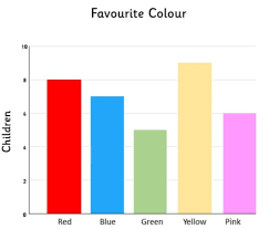
The length of each bar is proportional to the data they represent.
Line Graph
Line graphs are also called line charts, they are most often used for showing trends or patterns over time. Whereas a bar graph provides information about discrete categories that divide up the vertical axis, a line graph shows how values change over continuous values on the vertical axis over time on the horizontal axis. Line graphs are sometimes called trend graphs, slope graphs or Larry plots or they can be split into two separate line plots known as statistical line graphs.
Area Graph
Area graphs are similar to line charts, because both plots show an x-axis and a y-axis. Where area graphs differ from line graphs is that the area under the graph’s curve is filled in to provide additional context (similar to how shaded regions or elevation levels show how much of the graph is filled in).
Pie Graph/ Circle Graph
Pie or Circle graph is a circular statistical graphic which is divided into sectors to show proportion of the whole. It uses one complete circle to show entire set data and other subdivided circles for showing proportions of each subdivided group. One advantage of a pie chart is that it can easily shows how a part is related to a whole, for example in the below graph 1/5th of the pie represents 1/3rd of whole circle.
Histogram
A histogram is a chart that displays the distribution of values for numerical variables. They take a continuous range of numeric data and split it into segments, which are called intervals.
Scatter Plot
A scatter plot or a scatter graph is a type of mathematical diagram using Cartesian coordinates to display values for typically two variables for a set of data. Scatter plots can be used to understand the relationship between two variables.
A scatter plot can be used either when one continuous variable that is under investigation depends linearly on another, or when there is an assumption that standard statistical models apply and errors are normally distributed.
If the points appear scattered in a distinctive pattern, this would suggest a possible correlation between the two variables. However, there are some exceptions to this, where the distribution of points is not distinctive or exhibits outliers.
Different Types of Charts
Line Chart
A line chart is a type of graph that shows information as a series of points connected by a line.
The y-axis is used to show data, and the x-axis is used to display the time frame the data covers.
The graph displays a trend or pattern in successive values.
Pie Chart
A pie chart is a circle graph that shows the proportion of parts to a whole.
The size of each category represented in a pie chart corresponds with how much it represents the whole, and category values are often listed around the edges – also known as labeling – for quick reference.
Flowchart
A flowchart is a type of diagram that illustrates the steps to be taken in a process and the decisions to take.
Flowcharts depict processes and document them with symbols and labels.
The most common symbol for a decision point is the diamond shape, which uses both horizontal and vertical lines to show where to go based on whether or not an answer is true.
Gauge Chart
A gauge chart is one of the most common types of control charts. Gauge charts are often used to monitor variation in some process; for example, the thickness of metal sheets on a production line.
Gantt Chart
The Gantt chart is a project management and scheduling tool that shows and tracks the time and sequence in which tasks should be done.
Waterfall Chart
A waterfall chart is a type of graphical representation that shows the chronological progression of events, tasks, segments, or milestones spanning from left to right.
The chart displays a sequential list of ‘events’ in a vertical timeline and illustrates the following: the amount of time it took for each event to occur or take place.
Bullet Chart
A Bullet chart is a type of graph that displays information as a series of bars next to one another.
The width and height of the bar can vary depending on the trend or pattern in successive values.
The bars are often numbered; however, this is not always the case. When creating a bullet chart, it’s important to include values for each bar and use lettering for any accompanying text.
Funnel Chart
A funnel chart is a graphical representation of the percentage of products within a category that are purchased after first being categorized.
The chart parcels information by the top of the funnel, down to the bottom. The height of each segment on the graph can vary depending on the trend or pattern in successive values.
The only value provided with only four segments would be 20 percent. A funnel chart will usually use dots for values, but some present the data with bars next to one another.
Other Articles
- What is Software Development
- What is Technical Writing and why it is used
- How to Take Notes
- How to Give a Good Presentation
- What Is Emotional Intelligence
- What is Nonverbal Communication
- How to Develop Your Skill Set to Advance Your Career
- Setting Goals To Improve Your Career
- What is a SWOT Analysis
- How To Build Business Development Skills